Opportunity
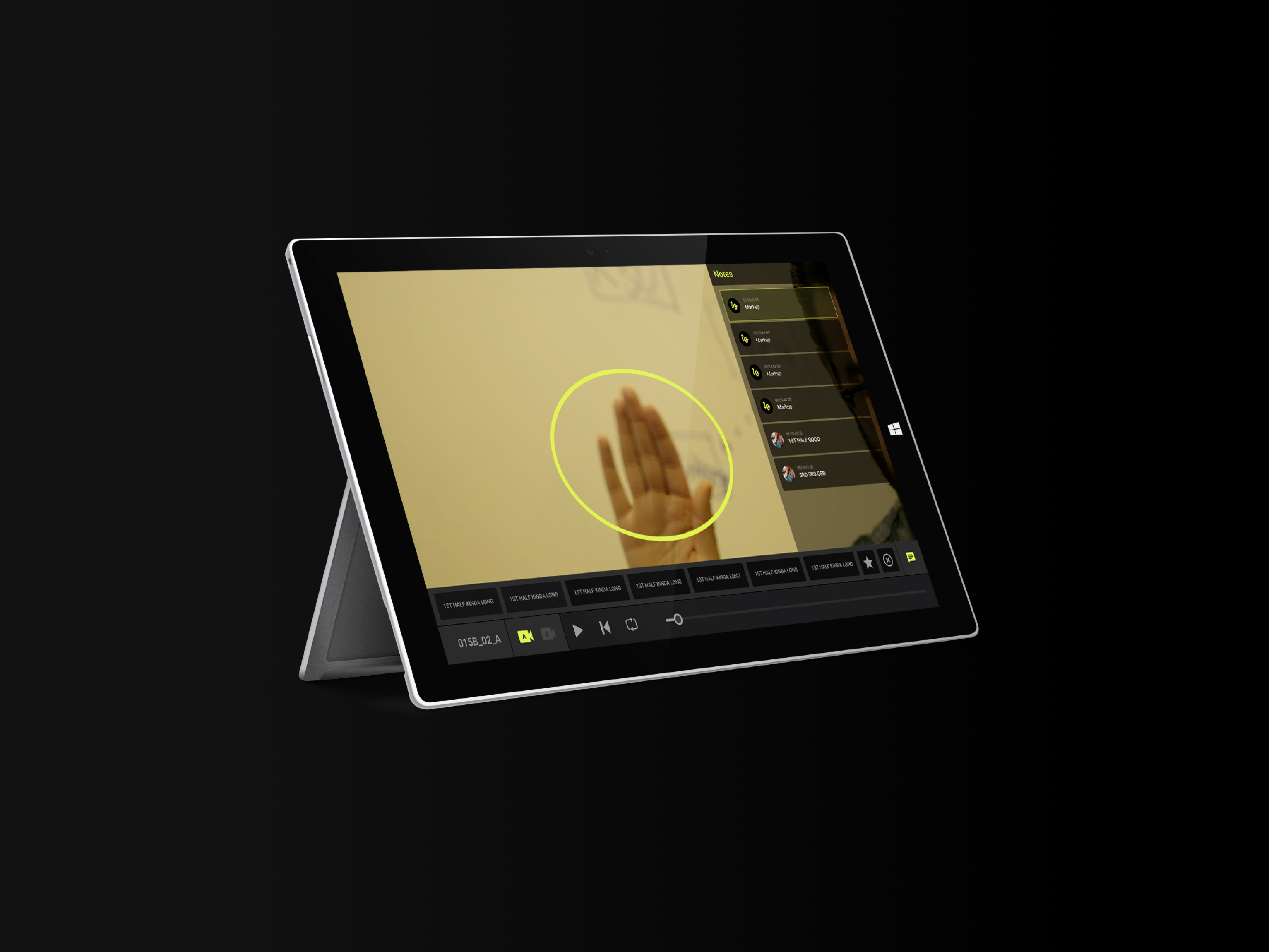
Many of PIX's users have Mac minis in their conference rooms for reviewing dailies. Renting and supporting these devices was seen as a necessary expenditure, but now with the widespread adoption of OTT (Over The Top/TV) units, there is an opportunity to launch a product that would allow PIX to deprecate the Mac minis so that they would no longer have to maintain and support physical devices.
Role
As Product Designer for this project, I was responsible for initial research, persona creation, user journeys, ideation, wireframing, prototyping, high fidelity designs, handoff and development support.
Goal
To quickly design and launch an OTT application that would replace Mac minis before they need a new round of updates.
QUALITATIVE RESEARCH
__________________________________________________________________________________________________________________
__________________________________________________________________________________________________________________
Most PIX users interact with their content on their computers or phones. The Mac minis make up a small subset of use cases. We focused the majority of our research phase on qualitative research to get to know how and why users were interacting with their content on the Mac minis.
Survey
I designed a survey in an effort to understand how PIX users were using the Mac minis as well as how and where they were generally interacting with their content across their devices. I also wanted to know what issues and pain points users experienced around accessing their PIX content.
Interviews
After sending out the surveys, we started setting up Zoom interviews with studios to figure out how these teams collaborated around their dailies content. I was also interested in learning why they were leasing Mac minis to watch their content instead of simply using the PIX desktop or mobile apps.
We also talked with studio clients who were in charge of business operations to see if there were a type of device and application would be most accessible to them.
We also talked with studio clients who were in charge of business operations to see if there were a type of device and application would be most accessible to them.
Oso taking notes during the interview design process
Results
At the end of our first two week research sprint, we had received about a 30% response rate from our survey, From the results, it became very clear why the mac minis were being used.
- 80% of Mac minis are used in conference rooms, mostly for daily review sessions
- Approximately 15% of devices were used by high level executives to keep in their offices and at home.
- Approximately 15% of devices were used by high level executives to keep in their offices and at home.
ANALYTICS
__________________________________________________________________________________________________________________
__________________________________________________________________________________________________________________
Now that we had an idea of the use cases, I wanted to see if I could get an idea of user's paths when viewing dailies. So I combed through the analytics data we had available. I was able to get a view of what actions users were taking while using the Mac minis.
It turns out, the average path through the system was fairly straightforward. Most sessions looked something like this:
SYNTHESIZING RESULTS
__________________________________________________________________________________________________________________
__________________________________________________________________________________________________________________
We heard a lot of similar feedback from many users during the interview process, so I synthesized the results into a set of design principles so we could be sure to keep user's needs and pain points in mind during the design process.
The Platform
We also gained enough insight from the research to feel confident moving forward with Apple TV as the platform for this new application. Several studios were already using Apple TVs in their offices, and a few had even requested a PIX application for tvOS.
PERSONA DESIGN
__________________________________________________________________________________________________________________
__________________________________________________________________________________________________________________
The insights we had gathered through the surveys, interviews, and user account and usage data helped greatly to inform who were designing for. We sat down with a few of the folks on our client team who used to work in the film industry and asked them to help me create personas based on their own experiences and the data we collected.
We designed three user types for PIX, two of which were key for the TV app.
We designed three user types for PIX, two of which were key for the TV app.
Primary TV User
The 'Studio exec' is a stakeholder who is responsible for the film but likely does not need to appear on set at all. Mostly high level execs and money people.
It also includes gatekeepers who have control over project organization and access to sensitive material (which in Hollywood is pretty much everything)
Through our interviews, we discovered that many studio folks simply review footage because they want to make sure everything is running smoothly and that there is progress on the set. Some may even just review it to show that it was "seen".
Accounts for the majority of TV users.
Secondary TV User
The 'Creative' user persona is designed around the people responsible for important details in the film process.
Includes: Directors, assistant directors, script crew
This persona type needs to be able to review exceptional quality, or even raw footage to do their jobs properly.
Through interviews, we discovered these types of users generally prefer to use their desktops to review footage, as the machines are more capable of handling high definition footage efficiently. But for dailies it's common to use a TV and for group review.
Accounts for a significant portion of TV users.
Tertiary TV User
The 'Worker' persona encompasses users on set that may need to review scenes but don't necessarily need access to high definition footage.
This includes: costumes, continuity, marketing reviewers, etc.
Accounts for a small portion of TV users. Because of this, we did not refer to the worker persona for this app's design.
This includes: costumes, continuity, marketing reviewers, etc.
Accounts for a small portion of TV users. Because of this, we did not refer to the worker persona for this app's design.
LOCK IT DOWN
__________________________________________________________________________________________________________________
__________________________________________________________________________________________________________________
After a couple sprints for research, we moved on to brainstorming and sketching sessions. The plan was to map out user journeys based on our Studio and Creative personas.
We invited some members of the development team to the brainstorming sessions to get all of our stakeholders up to speed. Not five minutes into the first session, our security lead made us aware that the sign in process would be even more integral to the app design than we had expected.
Because of some fundamental differences between the Mac Mini and Apple TV, we would need to bolster our sign in process significantly to make it more secure.
Our Product Owner gathered sign in requirements from different users, and our own security team, and we built out flows for the different options.
PIX has a robust set of admin controls, which means there are certain parameters that have to be designed into the secure log in process.
Admins have the ability to fine tune just about anything about a project including whether or not users are allowed to remember their usernames, passwords, or whether they have to enable a multi-factor authentication. There were a lot of cases to account for.
Admins have the ability to fine tune just about anything about a project including whether or not users are allowed to remember their usernames, passwords, or whether they have to enable a multi-factor authentication. There were a lot of cases to account for.
MINIMUM VIABLE PRODUCT
__________________________________________________________________________________________________________________
__________________________________________________________________________________________________________________
At this point, we wanted to put the product in front of users to get a feel for how painful the sign in process would be. Especially for users on projects with tight security.
So using what we learned from the interviews and surveys and keeping our user personas in mind, we came up with a model for an MVP.
So using what we learned from the interviews and surveys and keeping our user personas in mind, we came up with a model for an MVP.
For V1, we settled on just a few key features:
1. A Project selector
2. An Inbox for receiving content
3. A Player for viewing that content
1. A Project selector
2. An Inbox for receiving content
3. A Player for viewing that content
COMPARATIVE LANDSCAPE
__________________________________________________________________________________________________________________
__________________________________________________________________________________________________________________
The plan for the basic feature layout and flow of the TV app was nothing groundbreaking as far as PIX applications go. However, interacting with TV applications is a completely different animal.
As this was my first TV application, I wanted to better familiarize myself with best practices.
I took a few days downloading and playing with various Apple TV apps that had anything resembling features we had landed on. Especially media or content viewing. Obviously Netflix, Disney and other streaming services were at the top of the list, but I also tried to venture into other territory to get some fresh perspectives.
One of the most informing designs came from a rather unexpected place. Yummly's TV experience was far and away the most pleasing to use of the apps I tested. On top of that, their organizational hierarchy was similar to what we had in mind, and it was invaluable to see how it would behave in the real world. This surely saved me a lot of iteration time and also helped inform our lunch decisions for the day.
SKETCHING AND IDEATION
__________________________________________________________________________________________________________________
__________________________________________________________________________________________________________________
I started working on mocking up inbox layouts from the ideas I had gathered while checking out competitive products.
It seemed fairly obvious that a media content viewing device on a television platform would showcase thumbnail previews of the content, similar to streaming services.
It seemed fairly obvious that a media content viewing device on a television platform would showcase thumbnail previews of the content, similar to streaming services.
However, after I started adding real thumbnail images from one of our test projects, it became apparent that using big thumbnails to preview content may not be as useful or visually appealing as cover images for movie posters like you'd find on streaming platforms.
A lot of the content in PIX is the same shot, over and over and over and over.
A lot of the content in PIX is the same shot, over and over and over and over.
Clearly finding content could be difficult if the primary visual cue is an image and there are 100 nearly identical thumbnails to scroll through.
New layout
With a fresh perspective, I went back to the Apple TV for another quick round of comp analysis with more focus on applications that did not showcase images.
I mocked up a few more layout iterations to present to the team.
I mocked up a few more layout iterations to present to the team.
I made several scrollable prototypes and we tested them with our client team. We found most important data fields for users looking for content are:
1. Playlist/Clip name. Especially the first and last few characters!
2. An image still helped users find content faster, but was less crucial than the file name.
3. Date item was sent
4. Who sent the item
Other info that was important was tertiary, details that did not need to be seen until after the user found the item they were looking for.
We eventually ended up with this layout
USABILITY TESTING
__________________________________________________________________________________________________________________
__________________________________________________________________________________________________________________
After finishing all of the necessary screens for our MVP, I created a clickable prototype in Principle.
We were keen on gauging user's reactions to the new app, especially through the sign in process. I designed the prototype with configurable boolean states to allow us to walk users through different sign in flows This helped us to get an idea of how much friction there would be with all of the added security features.
I've included a quick video walkthrough of one of the sign in flows.
REDUCING LOGIN FRICTION
__________________________________________________________________________________________________________________
__________________________________________________________________________________________________________________
TV applications are incredibly clunky, due mostly to the limitations of the remote controls. Unfortunately, this can make simply logging into a device a nightmare.
With speed at the top of the list of items informing design decisions, I did some sleuthing to see if there were any ways we could reduce login friction.
Looking back at the analytics, most of our users were logging into PIX with iOS devices. So I made sure we accounted for compatibility with the Apple TV remote iOS app to allow users to use their devices to login to their Apple TVs using the keyboard.
As part of a later project, we built a web SSO to connect PIX sessions and I designed a solution for tvOS.
With the prototype functional, we flew out to LA to gather user data and feedback.
We visited a few different studios and also invited PIX users to our office to view the prototype of the new TV application to get feedback. It also gave us a chance for more intimate interviews to get a sense of what our users wanted from our software ecosystem.
We visited a few different studios and also invited PIX users to our office to view the prototype of the new TV application to get feedback. It also gave us a chance for more intimate interviews to get a sense of what our users wanted from our software ecosystem.
LAUNCH
_________________________________________________________________________________________________________________
_________________________________________________________________________________________________________________
We had a ton of feedback on the prototype. I was able to use our research to inform design decisions that would get the design to the final stages and approved for development.
PIX for Apple TV is now available on the TV app store.
PIX for Apple TV is now available on the TV app store.
IMPROVE
_________________________________________________________________________________________________________________
_________________________________________________________________________________________________________________
With the app now available to users, next steps are to implement analytics, monitor feedback, and continue to conduct usability studies to improve and release better versions going forward.
